Putting Hope in Reach
The Brief
Refresh the brand while maintaining the logo.
The current brand direction was too dark and doesn't convey the tagline of putting "Hope in Reach."


Refresh the brand while maintaining the logo.
The current brand direction was too dark and doesn't convey the tagline of putting "Hope in Reach."
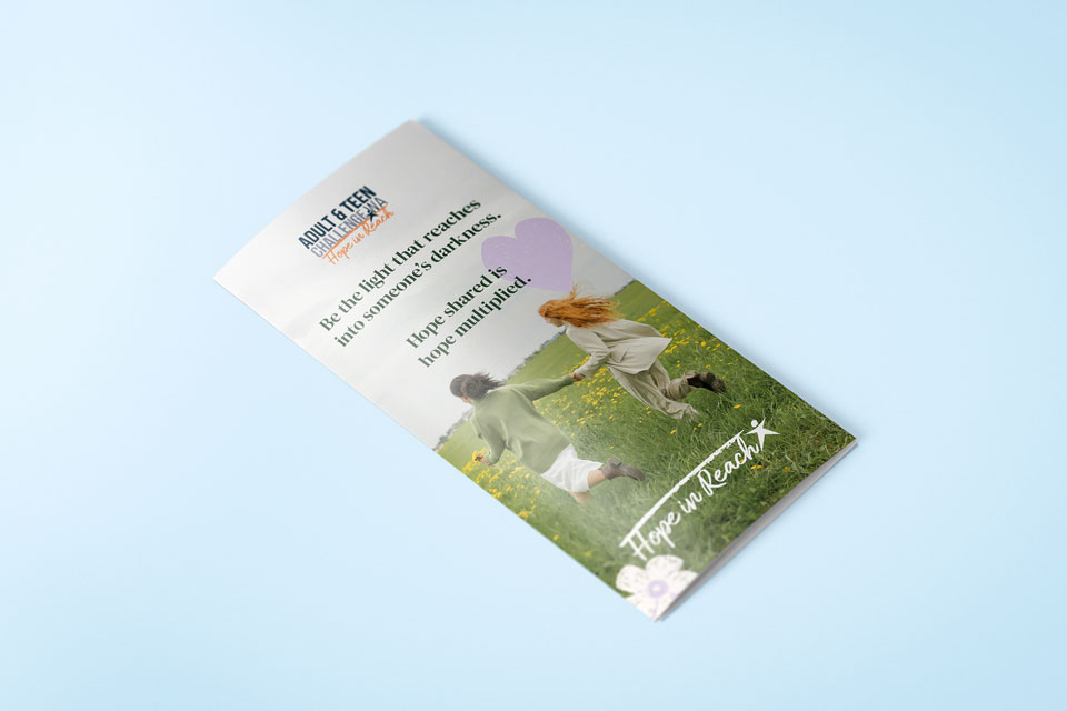
We started off by exploring several design and colour directions based on keywords they wanted the brnad to convey: "Soft," "Friendly," "Joyful."
The direction we ended up going with was one of pastel colours, handdrawn illustrations, and geometric shapes.


Click below to view our packages and see what we can create together.